
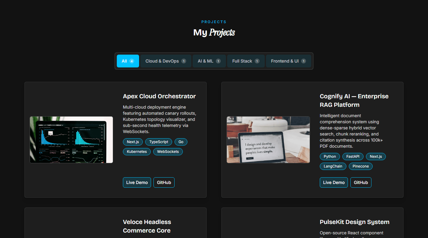
Project Grid·01
Interactive Filtered Projects Showcase
Category tabs filter with live project counts, responsive 2-column cards, tech tags, case study previews, and direct live/APK links.
Recommended For
developerdesignermarketergeneral
Browse all section variants created for developers, designers, marketers, and authors. Mix, match, and tailor components safely inside the Folioary editor.
Category tabs filter with live project counts, responsive 2-column cards, tech tags, case study previews, and direct live/APK links.
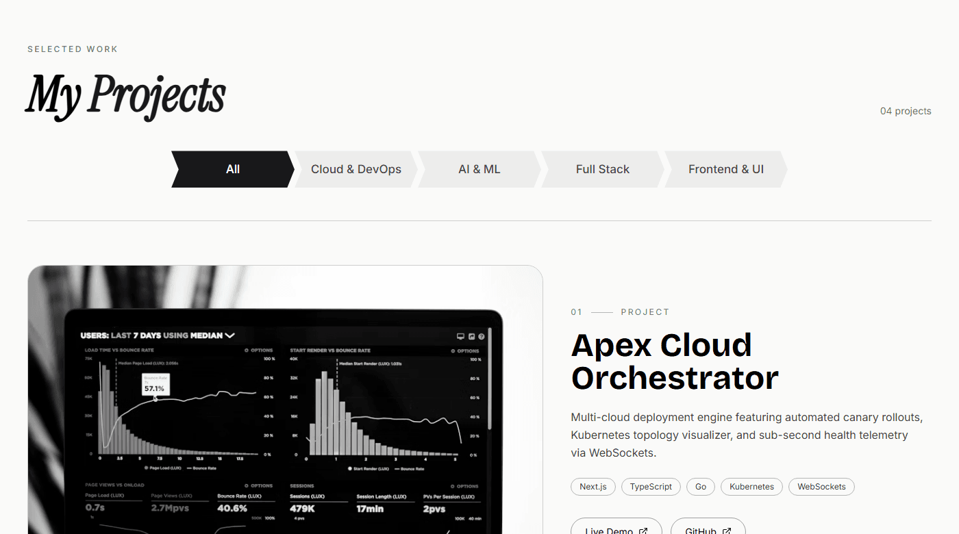
Alternating split media and narrative layout with dynamic category ribbons, numbered badges, tech tags, and dual repository/live actions.
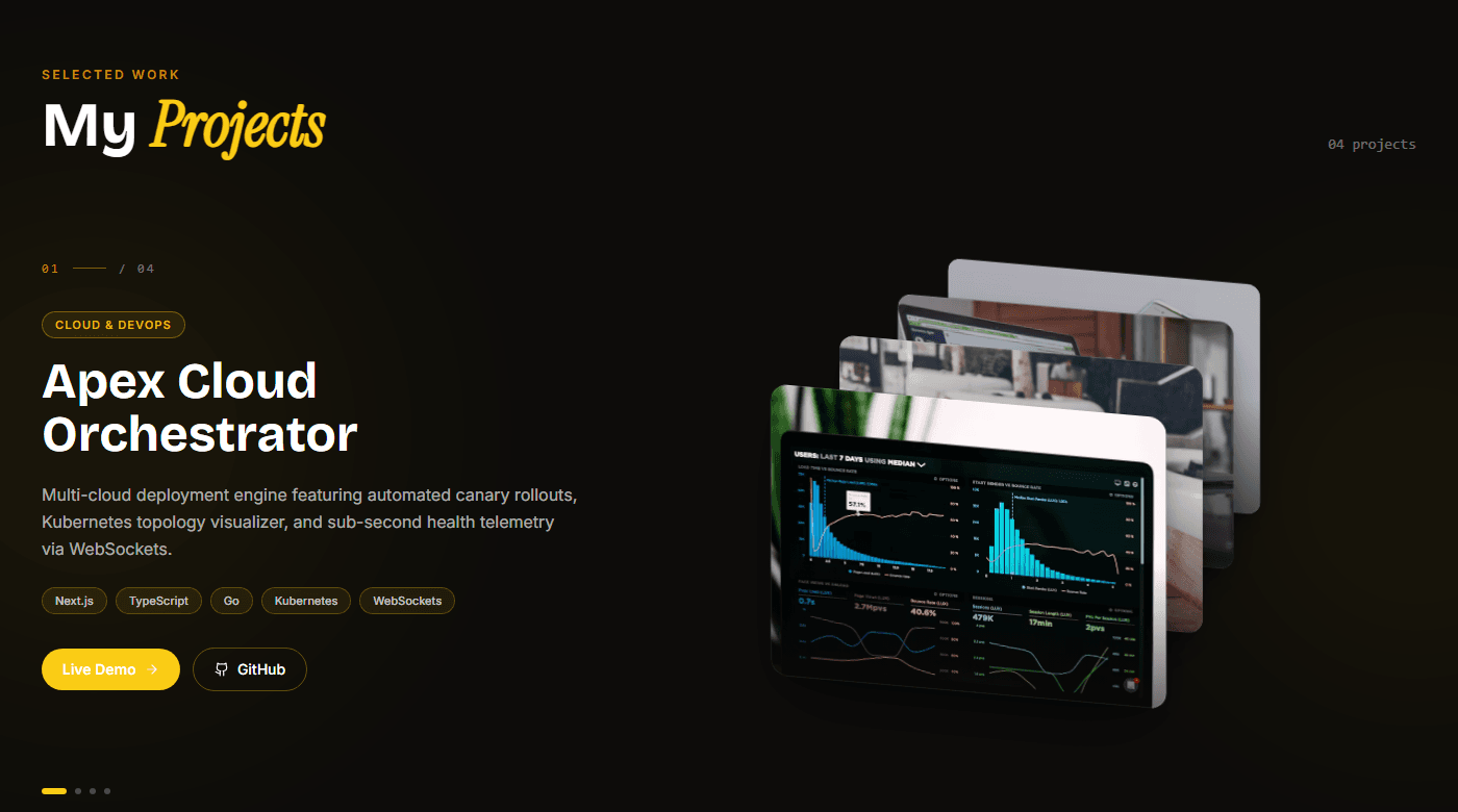
Interactive card-stack carousel with physics-based dragging; active card details animate in on the left while the stacked deck sits on the right.
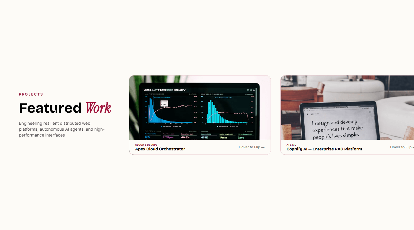
X-axis pinned horizontal scroll gallery featuring interactive 3D cards with aspect-video media on front and project details on back.

Social-style card feed with category/platform filtering, like & bookmark interactions, engagement counters, and glowing hover accents.

Image-first 4-column masonry grid that respects each photo's natural aspect ratio — perfect for designer portfolios with mixed-size project shots.

Image-first 3-column masonry grid with a slide-up hover overlay showing title, category, and action links — ideal for spacious editorial portfolios.

Swiper x-axis free-scroll strip where every slide height is fixed and each image's width is derived from its own intrinsic ratio via CSS — no JS measurement, portrait shots narrow, landscape shots wide.
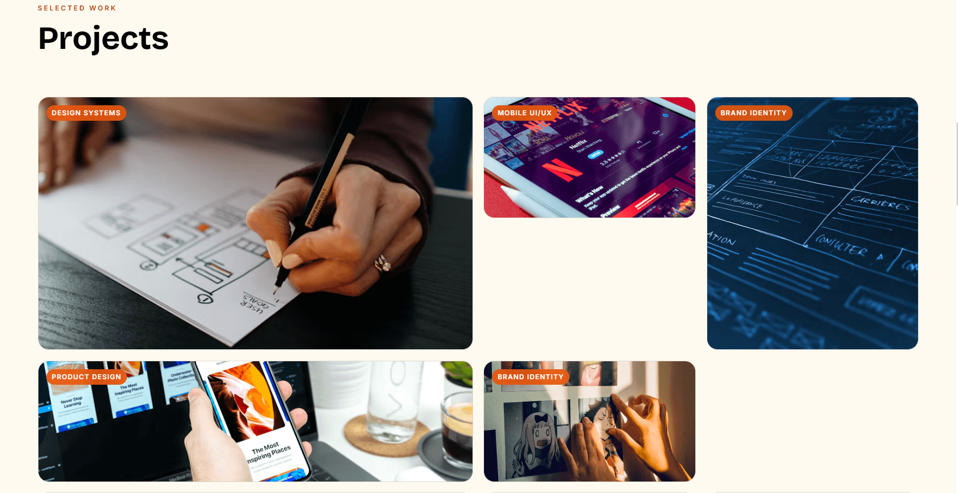
Mixed-size CSS bento grid cycling through 2×2, 1×2, 2×1, and 1×1 tiles — image-first with slide-up overlay, perfect for showcasing a diverse visual portfolio.